
Rebranding K-12 for the future.


At DH, we pride ourselves on the deep relationships we form with clients and the dynamic results we achieve by getting to know and work with them. Wenatchee School District (WSD) was one such client who we grew close with initially partnering on a school levy to fund vital district services. During that effort, we learned from and about the staff, teachers, students and families who make up the WSD community. So, we felt honored and ready when WSD approached us to help them write a messaging platform for their new strategic plan and design a complementary brand for the district.

The Opportunity
When we spoke to the community members who were part of WSD’s strategic planning committee, we learned that they felt the current logo — an apple atop a fountain pen — was outdated and didn’t reflect or appeal to everyone the district serves. Specifically, many students expressed confusion about the fountain pen, having never seen one before. And the apple, a common symbol for education, held an additional meaning in Wenatchee — “the apple capital of the world” — but was seen in different ways by people in the community, particularly for the families of farmworkers, who have a long and complex relationship with Wenatchee’s agricultural industry and its chief export.


The Approach
We began by listening, learning and working to understand all the qualitative and quantitative data WSD had gathered in the process of creating their updated strategic plan. Although we had learned a lot about WSD through the levy project, we wanted to dig deeper into research and learn more about the community.
What we did
The team
As we formed the DH team to work on this project, we carefully considered whose knowledge and background best aligned with the client’s needs. Alex. Evans, senior account director, and Linda Jones, creative director, headed up the team. Both knew the client well, having worked with WSD on their levy communication. Linda and Corie Bales, senior copywriter and content developer, also had experience working in the education field as an administrator and teacher, respectively. Finally, Ruben Escobedo, senior account executive, joined the team as a WSD alumni, offering his insight as a former student and Wenatchee resident.
Key Themes
Throughout the project, our team used language from the strategic plan and context sessions to inspire our efforts. Many of the key themes came directly from WSD’s promise to students:
We promise to build a foundation of diversity, equity, and inclusion from which each student emerges future ready.

The Work
The first piece we created was a messaging platform for the strategic plan. This strategic plan was board-approved but not yet ready to be fully launched and implemented. In the interim, DH created messaging to highlight the plan’s strengths and the ways it reflected teacher, student and parent feedback. We wanted to illustrate how the plan was an extension of policies already in place focused on improving students’ learning outcomes. We also wanted to demystify what the plan’s focus on diversity, equity and inclusion meant by sharing examples of what it would look like in practice and how it would impact students.
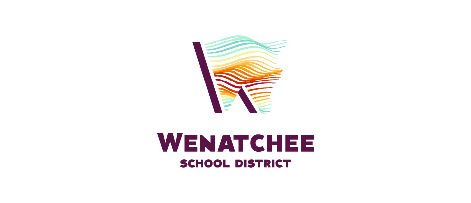
After the committee chose a final logo and DH refined the color palette based on their feedback, DH developed a strategic plan booklet bridging the old logo to the new brand elements. This booklet, designed by Art Director Matthew Duncan, was the community’s introduction to the strategic plan and their first look at the new brand elements. In-person team sessions helped us map the booklet’s layout — including content, photos and design elements — and build a mockup to share with WSD for approval. Taking time to create this mockup helped us move quickly and confidently through the work, so we could get the final booklet printed and into people’s hands.


The Results
When DH presented the logo and brand options to the strategic planning committee, articulating how their words and ideas inspired the final design options, the feedback from committee members was overwhelmingly positive. They shared how they felt heard throughout the process and how the designs brought to life elements of WSD they valued most. Students on the committee expressed enthusiasm for the possibility of wearing shirts and hoodies with the new logo. Out of the five design options, the committee unanimously chose the final design.
Corie reflects,
As a writer, I didn’t have a hand in creating the logo options, but the designers invited me to be part of their workshop sessions. I learned a lot by listening to them critique the designs and iterate based on the feedback. Having that window into the thought process behind each component of the designs helped me articulate to the committee what made each design special and tie it back to the messaging for the strategic plan. By working together, we brought the separate pieces of the project into a unified whole.