The new face of GSI
The challenge
GSI, the business development organization for our region, is a driver for progress and growth. But its sober visual identity lacked the energy and collaborative spirit that define its work. It was time for a makeover that would convey the sense of progress and fresh momentum at the heart of GSI’s mission.
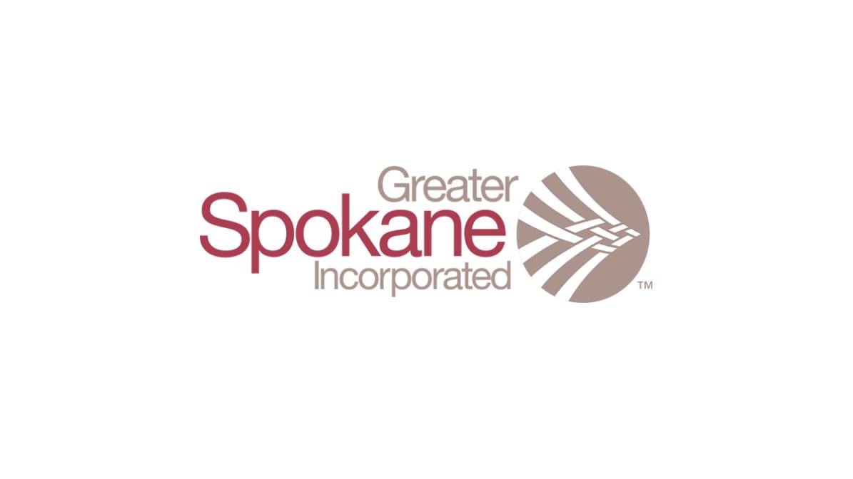
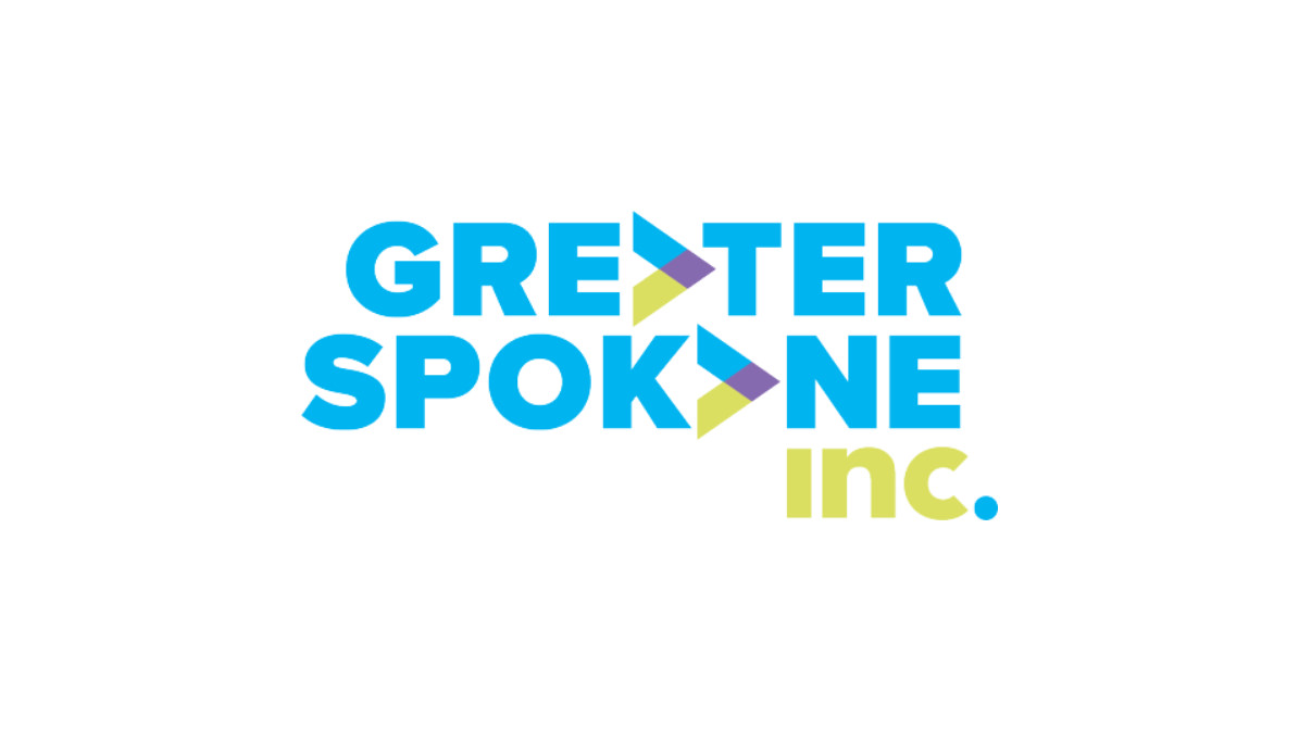
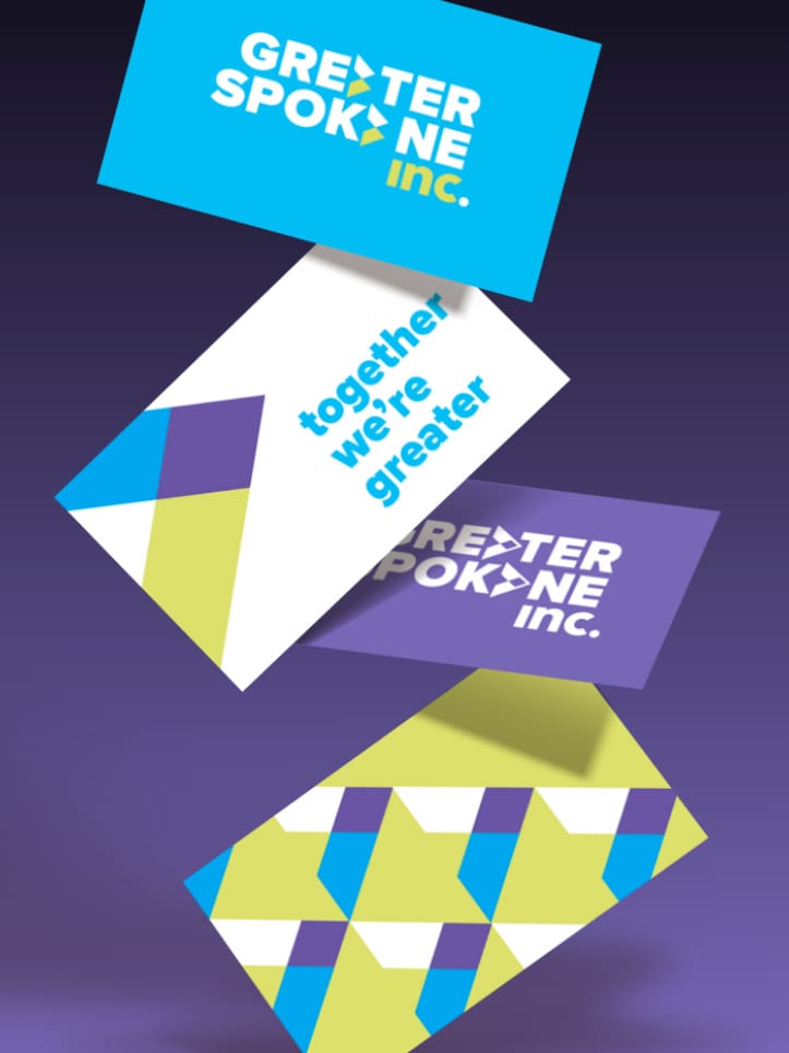
For GSI’s new logo, we dropped the stodgy-feeling “Incorporated” for a snappier “inc.” The “greater than” symbol suggests forward movement as it plays on the organization’s name. Amid the vibrant colors, the pop of purple provides a link to the branding executed by Visit Spokane, our region’s visitors bureau.
Spokane’s biggest economic driver got the visual identity it needed: forward-thinking and energized.
The strategy
DH surveyed GSI members and nonmembers — including people from business, government and nonprofits — about their perceptions of the organization. We also did a landscape review of similar organizations throughout the country.
We learned that GSI needed a bold, modern visual identity that would reflect its focus on the future. This fueled our creative work.
What we did
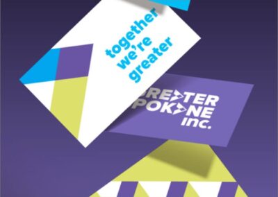
DH created a visual system and messaging that makes GSI feel modern, forward thinking and energized. We also embraced GSI’s promise to its members — that it would continue to provide a space for organizations to work together as advocates for our region’s. GSI’s new tagline, “Together we’re greater,” reflects that collaborative spirit.
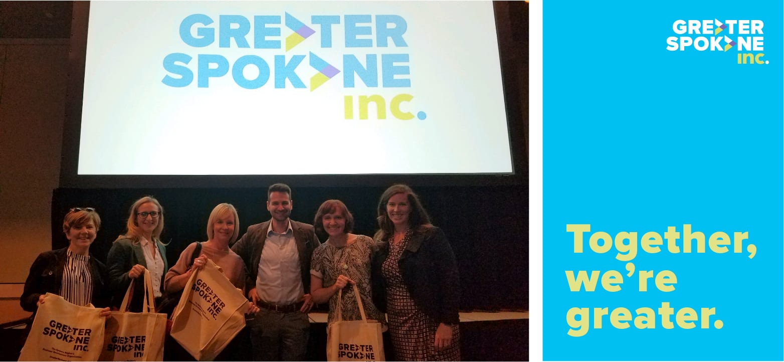
DH provided brand ambassador training to GSI employees and leaders, preparing them to share the organization’s key messages. The brand was unveiled at GSI’s annual meeting, attended by nearly 1,000 business leaders — to overwhelmingly positive feedback from members.
Results
At GSI, we’re always looking ahead, looking for solutions and dreaming big. Our rebranding with DH captures and conveys that energy — but they also helped us better understand and define it as central to our story and mission.

