Catalynt
BRAND DEVELOPMENT
After 30 years in business, TRInternational was ready for a new identity. Its name and visual system was bland and the name referenced its previous owner and didn’t reflect the energy of the team. This woman-owned company supplies raw materials and ingredients providing services to customers around the world. Catalynt’s rebrand conveys its growth and depth of services — as well as the talent and commitment of its team.
Tone & voice
Catalynt is one of the largest certified woman-owned suppliers and service providers for raw materials and ingredients in North America. It’s CEO and owner Megan Gluth-Bohan is ambitious, hard-working, caring and candid. These qualities have trickled down to their entire team. Capturing the energy and nuance of this personality in the brand was important to stand out in a mature industry with dated, safe and conservative messaging and brands. The DH team led the Catalynt team through a series of brand voice exercises ranging from car brands to pop-culture references. These exercises created a shared understanding of tone and priorities that were used to define the voice of Catalynt. In the brand guidelines, DH included tone and voice guardrails and created examples that are used to bring consistency and intentionality to their brand expressions.
Logo
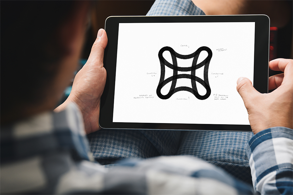
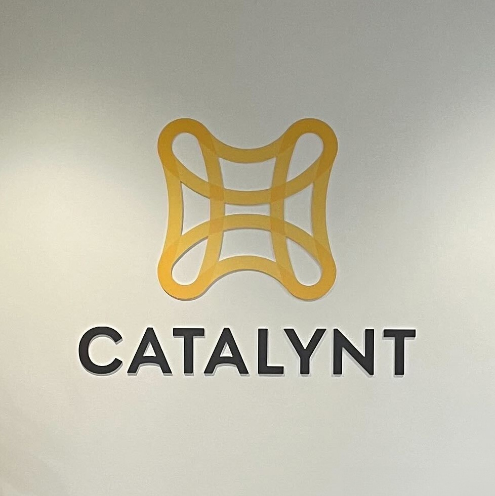
This woman-owned business had a new name, and its brand had to reflect its new identity, its values and its vision for the future. The logo was inspired by a mesh-like structure — sturdy and supportive but flexible, like Catalynt. We based the logotype on a typeface designed by a woman, Veronika Burien of Type Together. The elements of the logo and the principles behind it guided the rest of the brand’s development. The main colors, Gold and Rust, convey boldness and warmth. Supporting neutrals add function and utility. Those characteristics were reflected throughout the rebrand, including a new messaging platform.
Sub brand architecture
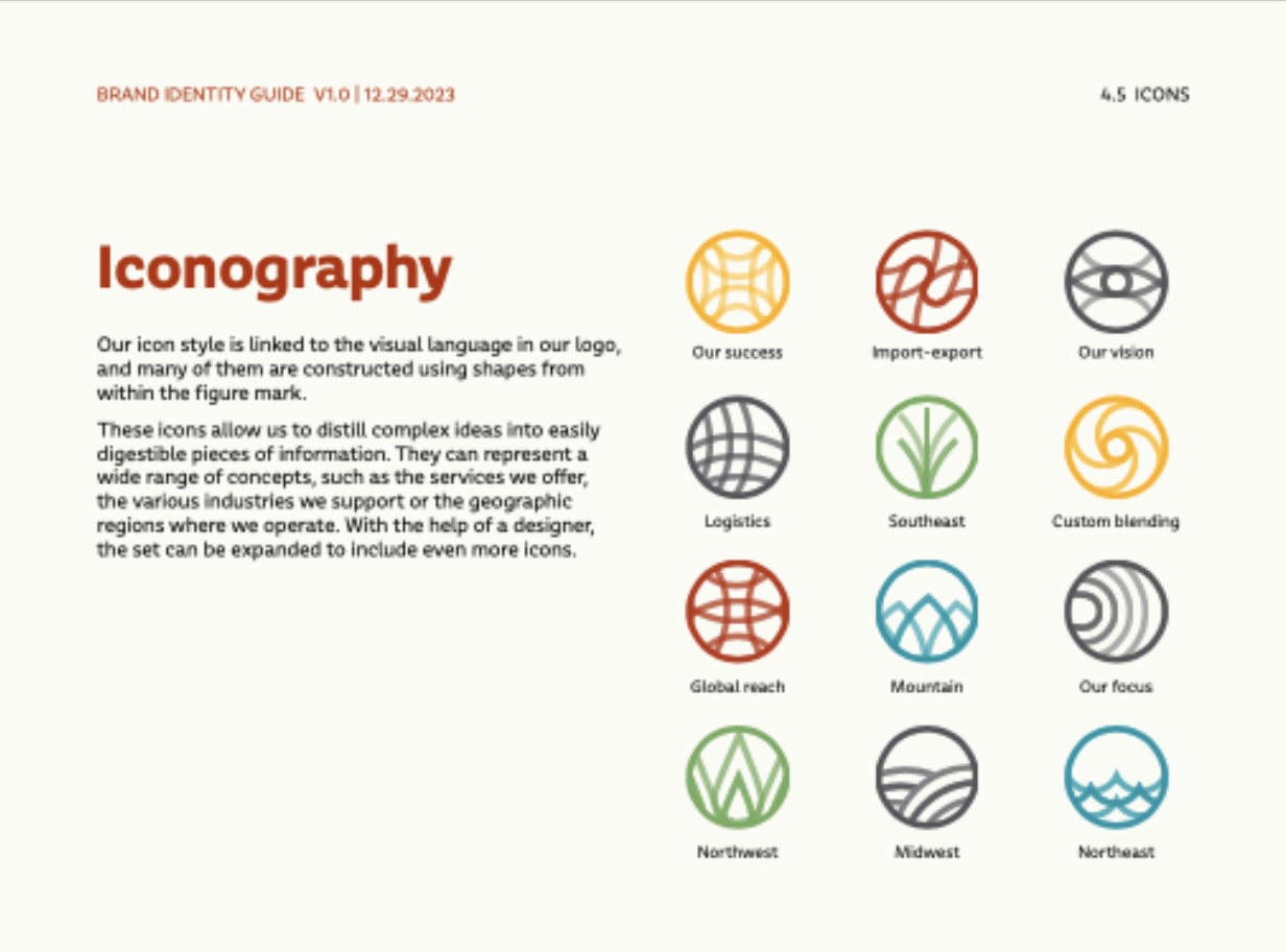
The design of Catalynt’s new logo was flexible. It has the ability to change and adjust based on its application. So when we created a new brand architecture system for future divisions or expanded services, we took a similar, malleable approach. The system borrows concepts from Google and Microsoft’s application icons that use elements from their parent logos to communicate relationship but also differentiate purpose. These icons or service marks use portions of the Catalynt logo rearranged in different ways to communicate locations and services lines. This system is flexible to accommodate future growth in a systematic way that aligns with the parent organization.
Brand guidelines
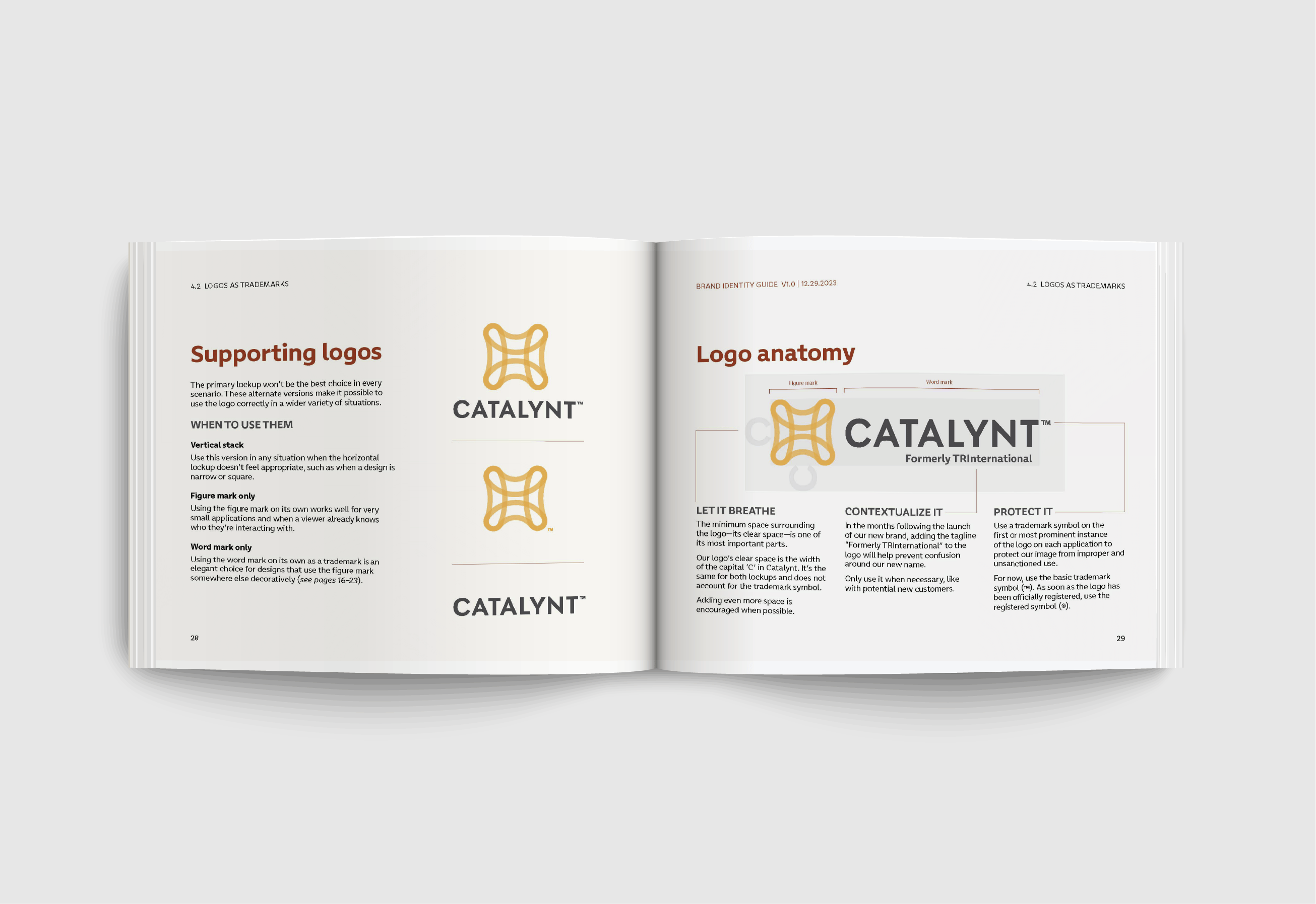
We produced a comprehensive brand guide explaining the company’s visual and messaging elements and how to use them—from logo, typeface and color use to messaging guidance. The guide captures design and tonal direction of the brand that provide direction for future brand expressions. This document tells the brand story as much as it provides a technical guide for designers and writers but was written in a way for non-designers and writers to understand. A hardbound copy of the guidelines was created and is present in the company’s headquarters lobby area as a coffee table book.
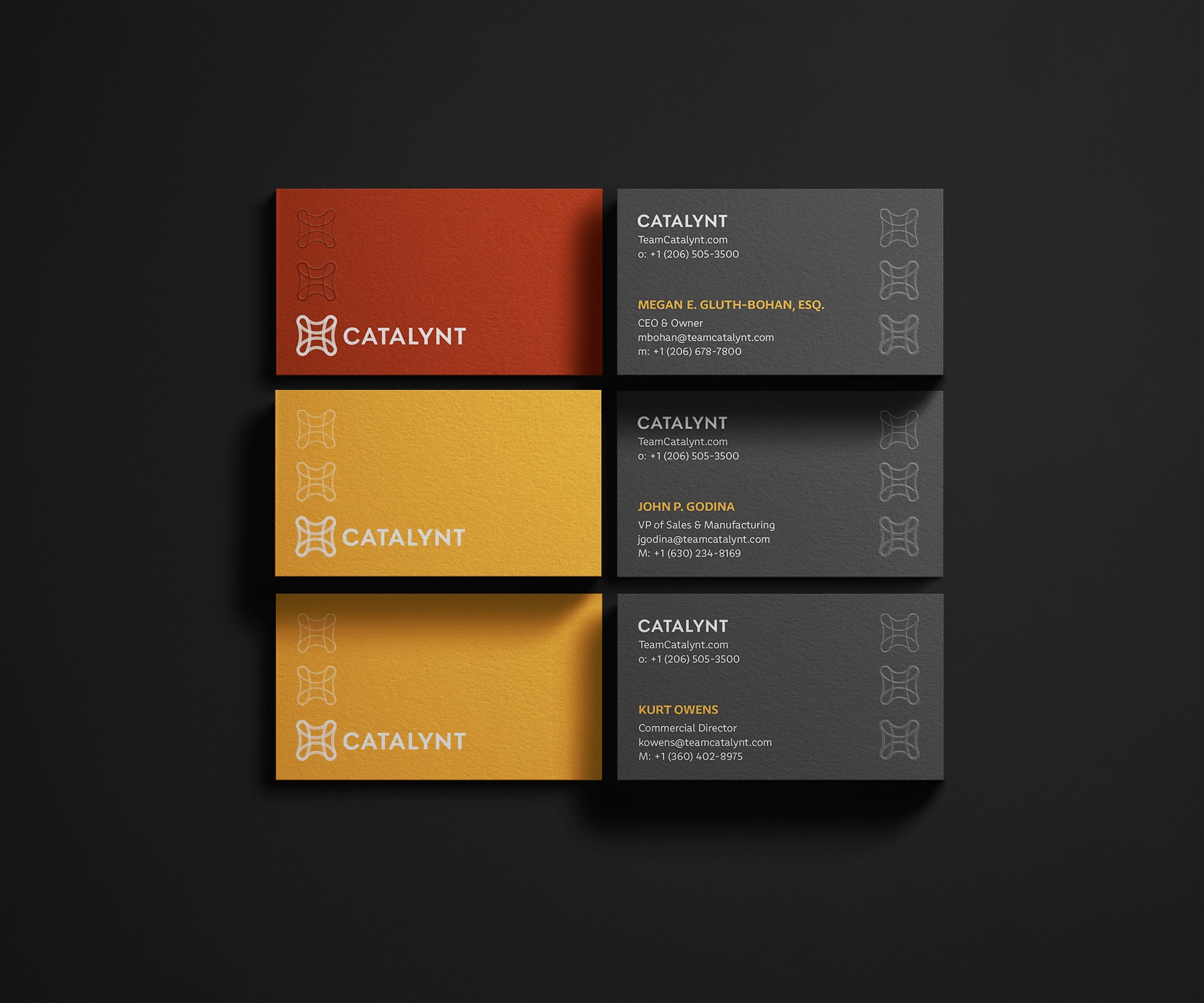
Collateral & swag
To support the launch of Catalynt’s rebrand, we created items to engage employees and clients. They included new business cards, logowear, event materials, and print and digital ads.
Signage at HQ
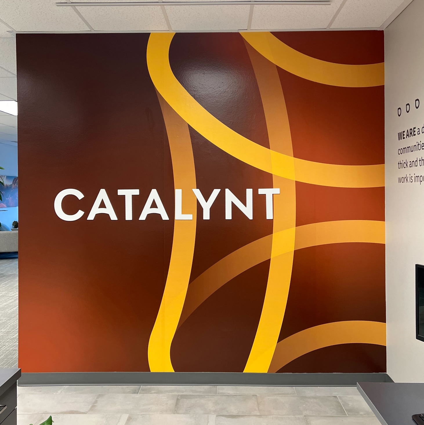
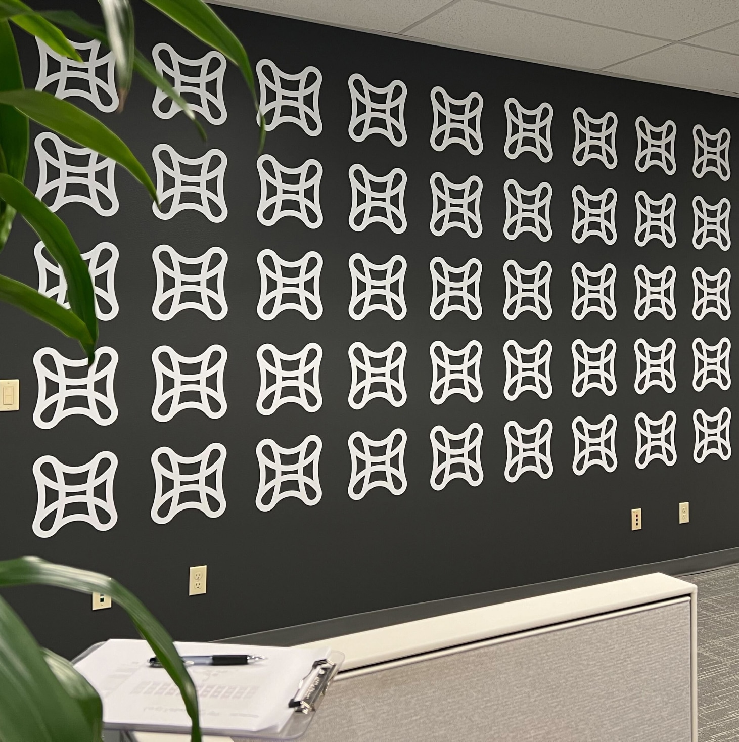
Catalynt needed signage and interior design elements to bring its new identity to life. We visited the company’s headquarters in Edmonds, Washington, and collaborated with theteam to select paint colors and key locations for signage and other branding elements. The changes in the space helped create a sense of warmth and welcome to employees, customers and partners.
Website design
Catalynt’s website provided the first opportunity for many potential customers to engage with the brand. We designed a new site that felt modern, welcoming and approachable, in line with its new identity — but also told Catalynt’s story as a global leader and innovator. The redesign reprioritized essential information and customer offerings while improving the overall user experience on mobile and desktop.
