A 100-acre transformation

The challenge
Forty years after it was built for Spokane’s World’s Fair, the city’s iconic gathering and wandering space underwent a large-scale transformation.
A hundred acres straddling the river and waterfalls in the heart of our lively downtown, Riverfront had a new energy — plus a new Carrousel, a new ice ribbon, a new central promenade, and a new centerpiece Pavilion. But the branding associated with the park was dated, with strong Expo ’74 vibes.
This $70 million-plus public investment, with a diverse array of stakeholders, needed a brand that would tell the story of its next 40 years.
We developed a messaging framework for Riverfront that started with a new brand promise: “Spokane starts here.” In the roaring heart of the city awaits a fully revitalized space that offers something for everyone, in every season.
The strategy
Riverfront belongs to everyone in Spokane, and the park owed its renewal to voters who approved the funding for its multiyear reconstruction. We knew there would be many stakeholders with many opinions about the park’s story — what it meant to our city, to our history, to our future. To hone in on the most important themes, we knew we’d need to listen carefully to diverse ideas from people in our city’s business, tourism, arts and other communities.
After holding a series of listening sessions, we established some criteria: The new brand had to feel sophisticated yet neighborly. It should feel be active and contemporary while honoring the park’s heritage. And it was important that Riverfront’s brand convey the idea of connection. The park is a confluence of nature and our urban environment — and a place where residents from all parts of our city come together to recreate, celebrate and relax.
Riverfront’s logo is emblematic of the system’s look and feel. The abstract design evokes elements of the park’s iconic structures — the tall vertical of the Clocktower and the cable-work of the pavilion — as well as the grid of streets and paths overlaying the park. Green, blue and gray represent the park’s natural and urban elements.
What we did
We created a brand system for Riverfront that is adaptable for our region’s four seasons and year-round roster of recreation opportunities, events and promotions.
Recognizing it would be important to introduce the park’s new brand to the public, DH recommended timing the launch to coincide with another big announcement: the opening of the ice ribbon, the first major project in the park’s redevelopment. DH created assets to bring the brand to life, including a large banner displayed in Spokane’s downtown mall, River Park Square; a video; a winter activity guide; and an event poster. The brand was introduced to the community at a ceremony at River Park Square.

Riverfront is a busy park, hosting myriad events and activities around the year. In addition to the main green, blue and gray colors, we created a secondary color palette that could flex according to use, adding flavor for events, activities and promotions. The warmer colors are inviting and exciting and work best in summer. The cooler colors evoke contemplation and peace and work well in winter. All the colors express the vibrancy and energy.
Visual brand assets for the park included a series of patterns.

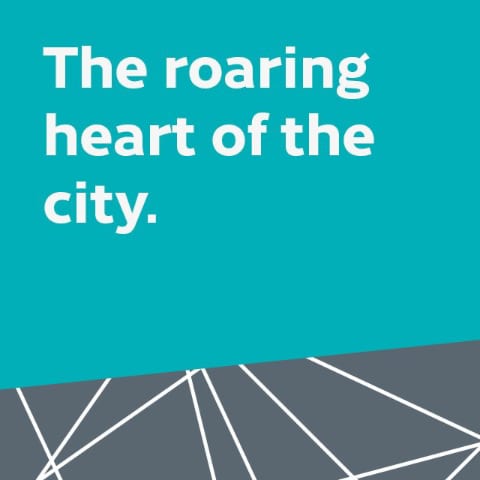

The park’s messaging system invites residents to play and explore.
Results
Thanks to DH, Riverfront Spokane’s branding wonderfully tells the story of our city’s revitalized urban gathering space – redefining its historical legacy into contemporary place making. They asked questions, listened well and provided thoughtful and practical solutions for realizing our community’s vision for Riverfront Park. DH’s guidance and activation of the brand helped ensure its consistency and longevity.


